
Tuesday 24 July 2012
Application of Exemplars
Process and Justification
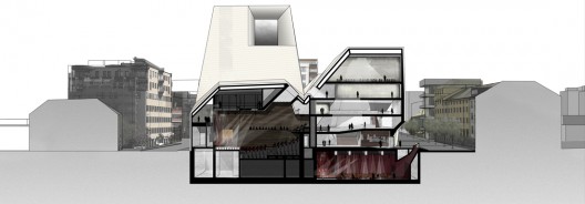
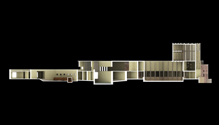
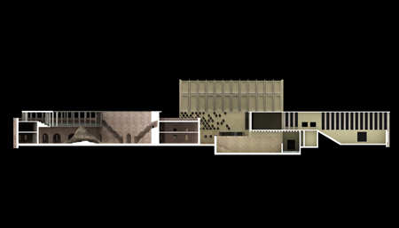
I selected the actual section cut because a longitudinal section showed more interior zones than a cross section. I felt the more space I showed, the more I would be able to demonstrate the spatial layout and functional zoning of building, therefore giving the viewer a greater opportunity to understand my building and how it worked. I also chose to cut through the stairs so there would be some understanding of how access and egress worked in my building.
My section drew elements from multiple sections; I used the criteria (particularly experience and tectonic) in determining the appropriate selection.
I followed the simple line work of Steven Holl and Jean Nouvel (and Langdon Reis) in order to contrast structure with space. This gave a clear indication of structure without being overly technical, something that could have taken away form the drawing's overall clarity as well as distracted the viewer from spatial qualities.
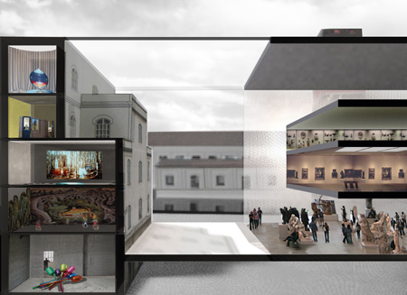
Jean Nouvel particularly inspired the layering and transparency of my interior elements, such as people and furniture; I believe this technique offered depth and a sense of movement in the section. Steven Holl's use of light and shadow was also inspiring, however I decided to make my lighting less opaque than Holl, as clarity of drawing was too important.
Again, Holl's real yet simple context and background were influential, but the contrasting of presence and absence of colour by Renzo Piano were the driving force in my own background.
In all this I remembered the brief: "Your drawings are to communicate as much information as possible about your building." Every decision centred around the question "does this add or subtract from understanding my design?" For example, when considering the use of lighting in Holl's V&A at Dundee, I felt that the opaque quality in the light would make it harder to identify furniture and people, which were important to understanding function and scale. Again, because of this, I focused heavily on expressing the 'Experience' of the building; this gave animation to the space, conveying as much understanding of spatial qualities and zoning to the viewer as possible. A simple line drawing section may have fulfilled the tectonic criteria, but would it have conveyed the experience criteria? I therefore mixed and maximised techniques as I felt best expressed the design intent.
I selected the actual section cut because a longitudinal section showed more interior zones than a cross section. I felt the more space I showed, the more I would be able to demonstrate the spatial layout and functional zoning of building, therefore giving the viewer a greater opportunity to understand my building and how it worked. I also chose to cut through the stairs so there would be some understanding of how access and egress worked in my building.
My section drew elements from multiple sections; I used the criteria (particularly experience and tectonic) in determining the appropriate selection.
I followed the simple line work of Steven Holl and Jean Nouvel (and Langdon Reis) in order to contrast structure with space. This gave a clear indication of structure without being overly technical, something that could have taken away form the drawing's overall clarity as well as distracted the viewer from spatial qualities.
Jean Nouvel particularly inspired the layering and transparency of my interior elements, such as people and furniture; I believe this technique offered depth and a sense of movement in the section. Steven Holl's use of light and shadow was also inspiring, however I decided to make my lighting less opaque than Holl, as clarity of drawing was too important.
Again, Holl's real yet simple context and background were influential, but the contrasting of presence and absence of colour by Renzo Piano were the driving force in my own background.
In all this I remembered the brief: "Your drawings are to communicate as much information as possible about your building." Every decision centred around the question "does this add or subtract from understanding my design?" For example, when considering the use of lighting in Holl's V&A at Dundee, I felt that the opaque quality in the light would make it harder to identify furniture and people, which were important to understanding function and scale. Again, because of this, I focused heavily on expressing the 'Experience' of the building; this gave animation to the space, conveying as much understanding of spatial qualities and zoning to the viewer as possible. A simple line drawing section may have fulfilled the tectonic criteria, but would it have conveyed the experience criteria? I therefore mixed and maximised techniques as I felt best expressed the design intent.
Exemplar Four: Steven Holl
I'm a big fan of Steven Holl's Storefront for Art and Architecture so I was interested to research him.
Light and Depth:
One characteristic of Holl's section is that they often contain extremely expressive light. This is found through his conceptual sketches, b&w sections and also in his Photoshopped sections.I selected these sections because of the expressive lighting and atmoshpere, but I also appreciated the sense of layers and depth that are hinted at. There's a sort of ephemeral and transparent qaulity in the interior, contrasted against the solid black lines of wall cuts. This expresses a clear distinction between space and structure.
Background and Context:
The section is defined from realistic background by the clear linework, as well as the contrast between interior and exterior light conditions. This is the route I believe I will take with my section; a background that clearly shows context and also how it might effect the spatial qualities and views of the building.
Furniture and People:
Figures clearly show scale and movement, however it lacks furniture. I don't believe furniture is necessary for every section (depending on the purpose of the section), however it is extremely useful for indicating space function and zoning. This section negates that issue with labels, but my section is the only drawing I have to communicate the spatial qualities and experiences of my space. I believe furniture will be a more effective way of showcasing this, while having the dual function of indication function/zoning.

 Above: 'V & A at Dundee' proposal

Above: Loisium Hotel
http://www.archdaily.com/5524/loisium-hotel-steven-holl/1409246225_06-section-aa/
Linework:
A more conventional section; it has extremely clear linework and lineweight, however I have decided against doing this kind of section. While it fulfills the tectonic criteria, it does not express the spatial qualities and experience of the spaces.
Light and Depth:
One characteristic of Holl's section is that they often contain extremely expressive light. This is found through his conceptual sketches, b&w sections and also in his Photoshopped sections.I selected these sections because of the expressive lighting and atmoshpere, but I also appreciated the sense of layers and depth that are hinted at. There's a sort of ephemeral and transparent qaulity in the interior, contrasted against the solid black lines of wall cuts. This expresses a clear distinction between space and structure.
Background and Context:
The section is defined from realistic background by the clear linework, as well as the contrast between interior and exterior light conditions. This is the route I believe I will take with my section; a background that clearly shows context and also how it might effect the spatial qualities and views of the building.
Furniture and People:
Figures clearly show scale and movement, however it lacks furniture. I don't believe furniture is necessary for every section (depending on the purpose of the section), however it is extremely useful for indicating space function and zoning. This section negates that issue with labels, but my section is the only drawing I have to communicate the spatial qualities and experiences of my space. I believe furniture will be a more effective way of showcasing this, while having the dual function of indication function/zoning.
Above: 'V & A at Dundee' proposalAbove: Loisium Hotel
http://www.archdaily.com/5524/loisium-hotel-steven-holl/1409246225_06-section-aa/
Linework:
A more conventional section; it has extremely clear linework and lineweight, however I have decided against doing this kind of section. While it fulfills the tectonic criteria, it does not express the spatial qualities and experience of the spaces.
Exemplar Three: Renzo Piano
As with Jean Nouvel, the majority of Renzo Piano's sections were extremely technical. In selecting exemplars I again filtered using the criteria (tectonic, while conveying experiential elements).

Above: Institute for Research and Coordination in Acoustics and Music, Paris.
Furniture and People:
In the above section I was especially drawn to the way the figures were responding to, and expressing, the functions of the rooms. It made me realise the potential of using figures to implicitly express function, opposed to explicitly stating it in a legend. I previously considering the most important value in figures was showing scale.
Background and Context:
There is a clear separation between the section and the context. This is defined through the presence and absence.of colour. Because I want my section to be as expressive I think it will be better for me to reverse this formula, using colour for my section and greyscale for my context. This will provide the same clarity of elements, while allowing full expression of spatial qualities.

Above: The Lingotto Factory Conversion, Turin, Italy
Lighting and Depth:
The lighting in this is very expressive, but I what was most interested in was the separation of depths in the section. Some elements (through use of shading) seem to protrude into the foreground, while others are in the background. This could be used to show, not only the true depth of spaces, but also to give a hierarchy of important spaces. If an architect is trying to convey the experience of one particular space above another, the more important view could be set in the 'forground' to first capture the viewers attention.
Jodidio. P. (2008). Piano: Renzo Piano Building Workshop 1966 to today. Koln: Taschen.
Garbato.c. & Ishida. S. (1989). Renzo Piano: Buildings and Projects 1971-1989. New York: Rizzoli International Publications Inc.
Random Research Continued
Depth and Light:
Similar with the previous example, I felt the sense of depth and expression of light in these sections illustrated and hightened the understanding of the spatial qualities of this building. A black and white section, while still conveying a sense of scale and layout, would not express the experiential qualities of the building to the same extent. Colour does not dominate, but enhances.
Context and background:
Interestingly, the background is only contrasted against the section through the use of linework, whereas as other sections often use extreme contrasting, such as an all white or greyscale background. Despite this, the section is still extremely clear and distinguishable from its context.
Linework:
The structure is clearly indicated through solid, thick linework, without being overly technical. This is contrasted against grey filled interior.


 Above: Library and Concert Hall (competition) Bodo, Norway by Langdon Reis
http://www.archdaily.com/17391/langdon-reis-architects-proposal-for-library-and-concert-hall-in-norway/
Similar with the previous example, I felt the sense of depth and expression of light in these sections illustrated and hightened the understanding of the spatial qualities of this building. A black and white section, while still conveying a sense of scale and layout, would not express the experiential qualities of the building to the same extent. Colour does not dominate, but enhances.
Context and background:
Interestingly, the background is only contrasted against the section through the use of linework, whereas as other sections often use extreme contrasting, such as an all white or greyscale background. Despite this, the section is still extremely clear and distinguishable from its context.
Linework:
The structure is clearly indicated through solid, thick linework, without being overly technical. This is contrasted against grey filled interior.


http://www.archdaily.com/17391/langdon-reis-architects-proposal-for-library-and-concert-hall-in-norway/
Random Research
Lighting:
I was drawn to the way both these examples had clear materiality, and while the lighting is extremely subtle it still expresses spatial qualities and depth. Lighting is not overly exaggerated, as is often found in sections, and I find the very refreshing. I believe that it is a better representation of of the true experience of the building.
Linework:
As with Nouvel's W hotel, linework is extremely simple solid fill, separating the solid structure from the spatial voids. I find this extremely effective, as it draws the eye to the spaces, while clearly separating one space from another. In a non technical section, where experiential qualities are key, I think this may be the most effective option.
Furniture and People:
In the first image, Furniture is used to show the function and zoning of the spaces; the people also highlight the function of the space through their actions, while also illustrating scale and movement. The second image contains very little of this, and as such space zoning is unclear.
Background and Context:
The first image has clear context that flows almost seamlessly from the section; this context enhances the tone of the drawing .The second image is set on a plain black background, which while contrasting excellently with the white linework, is not as expressive and captivating as the first image.
Prada Foundation by AMO
http://www.dezeen.com/2008/04/27/prada-foundation-by-amo/
Above: Island of Memory by Britton Chambers
http://www.dezeen.com/2008/05/25/island-of-memory-by-britton-chambers/
Exemplar Two: Jean Nouvel continued
While I felt the previous sections by Jean Nouvel fulfilled the criteria to a large degree, I felt it was important to find a section that expressed a greater sense of the 'experience'.
Linework and rendering:
These sections of Nouvel's W Hotel are highly expressive, but simple in their use of linework. Considering that our drawing are not to be technical/construction drawings, but rather demonstrate the spaces and experience of our building, this is an excellent exemplar.
The interior renderings have a sense of layering and transparency that add depth. I find this gives an almost 3D spatial experience for the viewer, enhancing understanding of the spatial qualities of the building.
In this case, I can see that the use of phtoshop has given a stronger sense of lighting, materials, atmosphere etc. However, Using the traditional black and white line work provides clear boundaries and details, which is important. I like that the photoshop is used only in a few elements, while still having the more traditional line sections. This can indicate a hierachy of information (by using colour to capture the viewers attention to one element first), but it can also simply segregate spatial information from one another.
Background and Context:
White background highlights simple linework; basic flora context is shown. The Hotel is near a beach, hence the tropical themed plants.
This is not particularly applicable to my project, as it is extremely important I show the context of the cliff face and height.
Furniture and People:
Furniture adds scale, experiential qualities, and also connotes space zoning. I absolutely love the layering of furniture and other elements, creating a sense of depth and even movement within the space. I think its sense of transparency means it does not dominate for attention, but simply enhances the spatial qualities outlined by the simple linework.


Design Magazine for Middle East and North Africa (DesMena)
DesMena. (2012). W Hotel, Dubai by Ateliers Jean Nouvel: A fresh approah at beachfront hospitality by the french architectural firm. Retrieved July 11, 2012, from http://desmena.com/?p=1155
Exemplar One: Jean Nouvel


Lucerne Kultur und Kongresscentrum (Lucerne, Switzerland)
I selected these sections by Jean Nouvel because the colours were immediately striking and caught my eye. I first thought the were simply zoning or to enhance the drawing but they are the actual physical interior colours.
Colour:
What I appreciate about the above sections is the expressive shading and colours. Not only do they provide contrast, but the shading, used in conjunction with the colour, also provide the drawings with a sense of depth. The first image is noticeably darker than the second, but I think this actually beautifully contrasts against and enhances the colours.
Background and Context:
No context, contrasted section against plain background.
Linework:
In parts linework is quite technical (particularly in the 2nd image) and I believe another exemplar might illustrate linework better suited to my project.
Morgan, C. L. (202). Jean Nouvel: the elements of architecture. London: Thames & Hudson.
Monday 23 July 2012
Understanding the Supplementary Criteria
Criteria In my understanding
"This assessment is to evaluate you have sufficient skill to identify and communicate critical aspects of your building proposal through architectural drawings."
Presence:
"This assessment is to evaluate you have sufficient skill to identify and communicate critical aspects of your building proposal through architectural drawings."
Presence:
The drawings must show the physical context, and illustrate the wider social and cultural context. social and cultural context is primarily involved conceptually, which is reflected back into the building's form.
Tectonic:
The drawings show flow between spaces as well as space zoning; they also illustrate that there is structure between the spaces. Access and Egress routes are also present.
Experience:
The drawings illustrate the spatial qualities and experience of the building. Figures are shown interacting within it; furniture highlights, not only the experience, but also the characteristics and zoning of spaces.
Communication:
The drawings communicate the experience of the building, as well as the overall design intent; techniques learnt from the exemplars have been applied.
Research:
Exemplar drawings were selected and analysed.
Exemplar drawings were selected and analysed.
3D Views express the exterior form of the building
Diagramming illustrates space zoning
"Your drawings are to communicate as much information as possible about your building."
With only one section and a site plan it will be difficult to fully express the concept and design of my building. I will supplement these drawings with 3D perspectives and diagrams to give as much information as possible, but I believe it will be extremely important for the section to be the most expressive illustration. In this case, it may be that it is less of a conventional line section, in order for it to fully express the experience and design.
Thursday 12 July 2012

Subscribe to:
Posts (Atom)